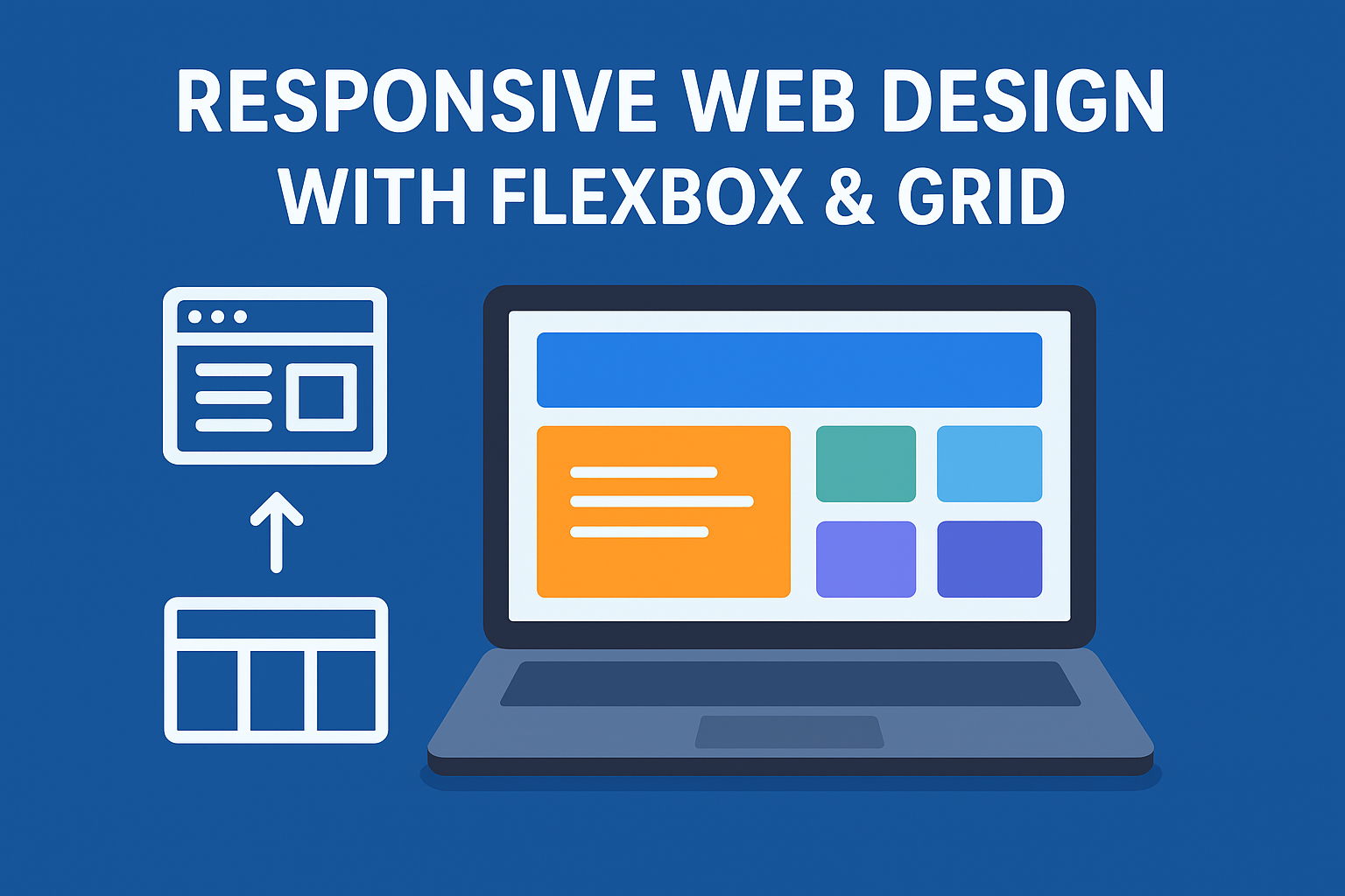
Responsive web design (RWD) has become an essential practice in modern web development, ensuring that websites provide optimal viewing experiences across a wide range of devices, from desktops to smartphones. With the increasing variety of screen sizes, a static, fixed-width layout is no longer sufficient. Flexbox and CSS Grid have emerged as powerful tools that enable developers to create flexible, adaptive layouts efficiently. Flexbox, or the Flexible Box Module, is designed for arranging elements in one-dimensional layouts, either as a row or column. It allows for dynamic spacing, alignment, and ordering of items without relying on floats or positioning hacks. Using properties like justify-content, align-items, and flex-wrap, developers can easily distribute space and align content, making responsive adjustments smoother and more intuitive.
On the other hand, CSS Grid introduces a two-dimensional approach to web layouts, enabling control over both rows and columns simultaneously. Grid layouts allow developers to define grid containers and place items precisely using properties such as grid-template-rows, grid-template-columns, and grid-area. Unlike Flexbox, which excels at linear distribution, Grid is ideal for complex layouts involving multiple rows and columns, making it perfect for dashboards, galleries, or entire web page structures. When combined, Flexbox and Grid provide unparalleled flexibility—Grid can handle the main page structure, while Flexbox can fine-tune the alignment of content within individual sections. Moreover, both techniques support media queries, which allows layouts to adapt seamlessly to different screen sizes and orientations, enhancing accessibility and user experience.
Implementing responsive design using Flexbox and Grid not only improves usability but also reduces development time and maintenance overhead. Traditional methods like floats and positioning required extensive manual adjustments for each device, often resulting in inconsistent layouts and fragile designs. By leveraging these modern CSS modules, developers can create scalable, maintainable, and visually appealing websites that work across all platforms. Additionally, responsive designs improve SEO performance and reduce bounce rates, as users are more likely to stay on a site that functions well on their device. In essence, mastering Flexbox and Grid is crucial for any web developer aiming to build modern, responsive, and user-friendly websites, making them indispensable tools in the ever-evolving landscape of web development.