Media queries are one of the most important concepts in modern web development, and they form the backbone of responsive web design. As users access websites from devices with massively different screen sizes—including smartphones, tablets, desktops, TVs, and even smartwatches—it becomes essential to make a website adjust smoothly to every screen. Media queries act as conditional rules that check for device characteristics such as screen width, height, resolution, orientation, and even color capabilities. Once a specific condition is true, a different set of CSS rules is applied. This allows developers to build layouts that adapt automatically without needing separate websites for different devices. Media queries were introduced as part of CSS3 and quickly became the industry standard for achieving responsiveness. They have transformed how web developers think about layout, user interface, and design flexibility.
Before media queries existed, developers often made separate websites for mobile and desktop, leading to duplicated work, inconsistencies, and increased maintenance. With media queries, you can maintain one codebase and deliver an optimized experience across multiple devices. This is especially important today because mobile usage has surpassed desktop usage in many parts of the world. A website that does not adapt gracefully to mobile can lead to poor usability, high bounce rates, and decreased conversions. Search engines like Google also prioritize mobile-friendly websites in their ranking algorithms, making media queries essential for SEO as well. They help developers create fluid layouts, responsive grids, dynamic typography, adaptive images, and device-specific interfaces. A modern web developer cannot build a professional product without understanding how to use them effectively.
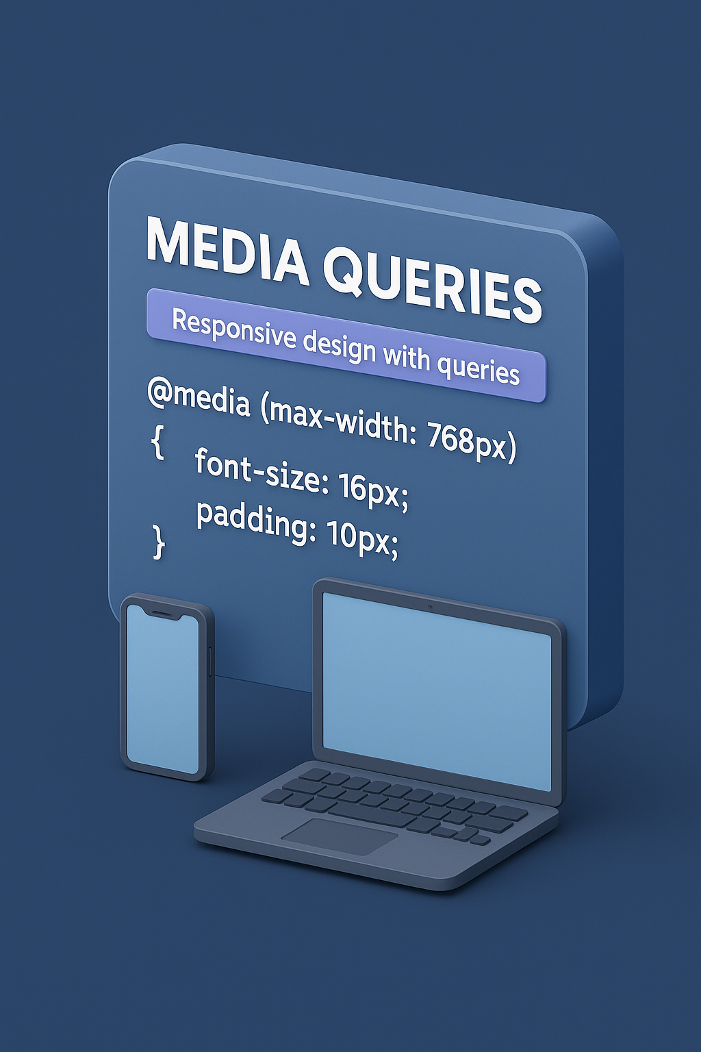
A media query follows a simple conditional logic syntax. It starts with the @media rule, followed by the condition, and then the CSS rules that should run when the condition is met. The most common property used in media queries is max-width, which targets screens smaller than a specific width. For example, @media (max-width: 768px) is a widely used breakpoint for tablets and small devices. Another commonly used feature is min-width, which applies rules above a certain screen width. Developers often combine both to create fluid, layered responsiveness. You can include multiple conditions using logical operators like and, not, and or. Modern media queries also support advanced features such as detecting color depth, pointer accuracy, device aspect ratio, reduced motion preferences, and more. They are powerful tools capable of customizing a website for almost any user environment.
Breakpoints are specific screen widths where the layout is adjusted. Although a site can technically have any number of breakpoints, industry standards have emerged based on typical device widths. Some common breakpoints include 320px for very small phones, 480px for regular phones, 768px for tablets, 1024px for small laptops, and 1200px or 1440px for desktops and large screens. These are not mandatory but serve as excellent guidelines for building device-responsive designs. Many modern developers prefer the mobile-first approach, where styles are written first for small screens using default CSS, and media queries with min-width are used to scale up to larger screens. Others use desktop-first development with max-width. Tailwind, Bootstrap, and other frameworks internally use a well-structured breakpoint system based heavily on media queries. Choosing the right breakpoints and structuring them properly can greatly improve maintainability and readability of the code.
One of the biggest uses of media queries is adjusting layout styles at different screen widths. For example, a layout might require a single-column view on mobile but a two-column or three-column grid for tablets or desktops. Using media queries, developers can easily switch between flexbox and grid configurations, adjust width percentages, change padding, switch direction of elements, or hide specific items on smaller screens. Buttons and text may need to grow or shrink depending on the device. Navigation bars, in particular, frequently rely on media queries—showing a hamburger menu on mobile, expanding to a full navigation on desktop, and repositioning elements accordingly. Media queries can also help reposition images, reflow content blocks, change aspect ratios, or resize containers dynamically. They allow the same webpage to look clean, readable, and usable regardless of the device.
Beyond layout, media queries play a crucial role in responsive typography and image scaling. A font size that looks readable on a desktop might feel oversized on a mobile device, while a small mobile font might appear tiny on a large monitor. Media queries help adjust typography styles—font sizes, line height, letter spacing, and heading sizes—across different resolutions. Similarly, images can be resized, cropped, or replaced based on the device. High-resolution images may be served to devices with retina screens using resolution-based media queries. Buttons, forms, input fields, and UI elements also adjust to fit comfortably within the available space. Padding and margin shrink or expand. Touch-based devices may require larger tap targets, which can be addressed using pointer detection queries. Overall, media queries give developers granular control to ensure readability and usability across all form factors.
Media queries have evolved significantly beyond simple width-based conditions. Modern CSS includes several advanced features to improve user experience. For instance, the prefers-color-scheme query detects if a user prefers dark mode or light mode, allowing developers to design theme-adaptive websites. Another powerful feature is prefers-reduced-motion, which checks whether the user prefers limited animations—useful for accessibility, as some users may get motion sickness from excessive animations. The hover and pointer queries help determine whether the device uses a mouse, touch screen, or stylus, allowing developers to adapt interactions accordingly. There are also media queries for detecting landscape vs portrait orientation, aspect ratios, high-resolution displays, and even screen refresh rate capabilities. These advanced features make media queries not just a tool for responsive design but a bridge for accessibility and device-specific customization.
Writing too many media queries can create messy, hard-to-maintain CSS. Efficient development involves identifying the breakpoints that actually matter for your design rather than adding dozens of rules. Following a systematic approach helps: using mobile-first development with min-width, grouping related styles together, and avoiding conflicting breakpoints. Many developers store breakpoints as variables—especially when using preprocessor languages like SASS or LESS. Reusable patterns, utility classes, and consistent naming conventions make large projects easier to manage. Frameworks like Tailwind and Bootstrap encapsulate media queries into predefined classes, reducing the need to write raw CSS. Understanding how to balance custom media queries vs framework-provided breakpoints is a key skill for modern developers. Well-structured media queries lead to faster development, cleaner code, and reduced duplication.
As technology evolves rapidly, media queries continue to adapt. New device categories such as foldable phones, wearables, in-car screens, and large 4K televisions introduce additional complexity. CSS’s evolving specifications promise more powerful features that can detect user contexts, environment lighting, dynamic viewport sizes, and more. Yet the core purpose remains unchanged: to deliver a smooth, consistent, and user-friendly experience across all platforms. Mastering media queries is therefore essential for every web developer, whether beginner or advanced. They form the foundation of responsive design and allow the web to remain accessible, functional, and beautiful on any device. Once you understand how to use media queries effectively, you gain the power to build websites that feel natural everywhere—from small phones to giant screens—ensuring your design adapts to the user's world, not the other way around.
Before media queries existed, developers often made separate websites for mobile and desktop, leading to duplicated work, inconsistencies, and increased maintenance. With media queries, you can maintain one codebase and deliver an optimized experience across multiple devices. This is especially important today because mobile usage has surpassed desktop usage in many parts of the world. A website that does not adapt gracefully to mobile can lead to poor usability, high bounce rates, and decreased conversions. Search engines like Google also prioritize mobile-friendly websites in their ranking algorithms, making media queries essential for SEO as well. They help developers create fluid layouts, responsive grids, dynamic typography, adaptive images, and device-specific interfaces. A modern web developer cannot build a professional product without understanding how to use them effectively.
A media query follows a simple conditional logic syntax. It starts with the @media rule, followed by the condition, and then the CSS rules that should run when the condition is met. The most common property used in media queries is max-width, which targets screens smaller than a specific width. For example, @media (max-width: 768px) is a widely used breakpoint for tablets and small devices. Another commonly used feature is min-width, which applies rules above a certain screen width. Developers often combine both to create fluid, layered responsiveness. You can include multiple conditions using logical operators like and, not, and or. Modern media queries also support advanced features such as detecting color depth, pointer accuracy, device aspect ratio, reduced motion preferences, and more. They are powerful tools capable of customizing a website for almost any user environment.
Breakpoints are specific screen widths where the layout is adjusted. Although a site can technically have any number of breakpoints, industry standards have emerged based on typical device widths. Some common breakpoints include 320px for very small phones, 480px for regular phones, 768px for tablets, 1024px for small laptops, and 1200px or 1440px for desktops and large screens. These are not mandatory but serve as excellent guidelines for building device-responsive designs. Many modern developers prefer the mobile-first approach, where styles are written first for small screens using default CSS, and media queries with min-width are used to scale up to larger screens. Others use desktop-first development with max-width. Tailwind, Bootstrap, and other frameworks internally use a well-structured breakpoint system based heavily on media queries. Choosing the right breakpoints and structuring them properly can greatly improve maintainability and readability of the code.
One of the biggest uses of media queries is adjusting layout styles at different screen widths. For example, a layout might require a single-column view on mobile but a two-column or three-column grid for tablets or desktops. Using media queries, developers can easily switch between flexbox and grid configurations, adjust width percentages, change padding, switch direction of elements, or hide specific items on smaller screens. Buttons and text may need to grow or shrink depending on the device. Navigation bars, in particular, frequently rely on media queries—showing a hamburger menu on mobile, expanding to a full navigation on desktop, and repositioning elements accordingly. Media queries can also help reposition images, reflow content blocks, change aspect ratios, or resize containers dynamically. They allow the same webpage to look clean, readable, and usable regardless of the device.
Beyond layout, media queries play a crucial role in responsive typography and image scaling. A font size that looks readable on a desktop might feel oversized on a mobile device, while a small mobile font might appear tiny on a large monitor. Media queries help adjust typography styles—font sizes, line height, letter spacing, and heading sizes—across different resolutions. Similarly, images can be resized, cropped, or replaced based on the device. High-resolution images may be served to devices with retina screens using resolution-based media queries. Buttons, forms, input fields, and UI elements also adjust to fit comfortably within the available space. Padding and margin shrink or expand. Touch-based devices may require larger tap targets, which can be addressed using pointer detection queries. Overall, media queries give developers granular control to ensure readability and usability across all form factors.
Media queries have evolved significantly beyond simple width-based conditions. Modern CSS includes several advanced features to improve user experience. For instance, the prefers-color-scheme query detects if a user prefers dark mode or light mode, allowing developers to design theme-adaptive websites. Another powerful feature is prefers-reduced-motion, which checks whether the user prefers limited animations—useful for accessibility, as some users may get motion sickness from excessive animations. The hover and pointer queries help determine whether the device uses a mouse, touch screen, or stylus, allowing developers to adapt interactions accordingly. There are also media queries for detecting landscape vs portrait orientation, aspect ratios, high-resolution displays, and even screen refresh rate capabilities. These advanced features make media queries not just a tool for responsive design but a bridge for accessibility and device-specific customization.
Writing too many media queries can create messy, hard-to-maintain CSS. Efficient development involves identifying the breakpoints that actually matter for your design rather than adding dozens of rules. Following a systematic approach helps: using mobile-first development with min-width, grouping related styles together, and avoiding conflicting breakpoints. Many developers store breakpoints as variables—especially when using preprocessor languages like SASS or LESS. Reusable patterns, utility classes, and consistent naming conventions make large projects easier to manage. Frameworks like Tailwind and Bootstrap encapsulate media queries into predefined classes, reducing the need to write raw CSS. Understanding how to balance custom media queries vs framework-provided breakpoints is a key skill for modern developers. Well-structured media queries lead to faster development, cleaner code, and reduced duplication.
As technology evolves rapidly, media queries continue to adapt. New device categories such as foldable phones, wearables, in-car screens, and large 4K televisions introduce additional complexity. CSS’s evolving specifications promise more powerful features that can detect user contexts, environment lighting, dynamic viewport sizes, and more. Yet the core purpose remains unchanged: to deliver a smooth, consistent, and user-friendly experience across all platforms. Mastering media queries is therefore essential for every web developer, whether beginner or advanced. They form the foundation of responsive design and allow the web to remain accessible, functional, and beautiful on any device. Once you understand how to use media queries effectively, you gain the power to build websites that feel natural everywhere—from small phones to giant screens—ensuring your design adapts to the user's world, not the other way around.