Typography is one of the most critical components of modern web design because text is the primary medium through which users consume information. Good typography enhances readability, improves user engagement, and shapes the visual identity of a website. However, with users accessing websites on phones, tablets, laptops, and large monitors, typography can’t be static anymore. It must adapt to different screen sizes and resolutions. This is where responsive typography comes into play. Responsive typography ensures that text automatically scales, adjusts, and maintains readability regardless of the device being used. It contributes to better accessibility, improved user experience, and a more professional look for digital interfaces.
Responsive typography refers to the practice of designing and implementing text styles that adjust fluidly across various screen sizes. In traditional web design, pixels were used as fixed units, causing text to appear too small on mobile screens or too large on wide desktop screens. Responsive typography solves this by using scalable units such as em, rem, vw, vh, and CSS functions like clamp(). It ensures consistency in hierarchy, spacing, line height, and letter spacing across devices. More importantly, it provides designers with the flexibility to create visually balanced content that remains meaningful and comfortable for readers, regardless of how they access the website.
Typography Units: px, em, rem, %, vw & vh
To create responsive typography, understanding CSS units is essential. Pixels (px) are absolute units—not ideal for responsive designs because they don’t scale automatically. em units are relative to the font size of their parent elements, making them useful for sizing nested text. rem units are relative to the root (HTML) font size, providing consistency throughout the project. Percentage (%) can be used for fluid resizing in certain contexts. Viewport units such as vw (viewport width) and vh (viewport height) enable typography that grows according to the screen size. A modern method involves using clamp(min, preferred, max) which allows text to scale smoothly within a controlled range. Mastering these units gives designers the flexibility to create truly responsive text.
The Role of Hierarchy and Type Scale
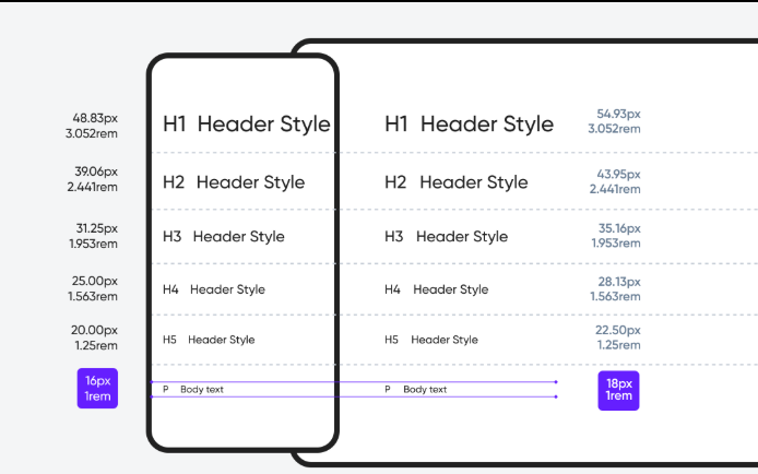
Hierarchy is the visual arrangement that guides users through the content. Responsive typography requires a strong hierarchy so that headings, subheadings, and body text scale proportionally across devices. Designers often use modular scales such as 1.25, 1.33, or 1.5 to create harmony between different text levels. For example, setting body text at 16px and using a scale factor of 1.25 yields a consistent hierarchy for h1, h2, h3, and paragraph text. Tools like Type Scale or CSS clamp make it easy to implement these scales. When hierarchy is maintained, users can quickly scan content, understand structure, and navigate with ease—making the experience intuitive and pleasant.
Line Height, Line Length & Spacing Principles
Responsive typography is not just about font size; it also involves line height, line length, letter spacing, and paragraph spacing. Proper line height (usually 1.4–1.8) enhances readability by giving text enough breathing room. Line length should ideally be between 45–75 characters per line for optimal reading. On mobile screens, shorter line lengths improve comfort, while on desktops, slightly longer lines work better. Adequate spacing between paragraphs and elements prevents text from looking crowded. All these values must scale responsively to maintain readability—tight spacing may look fine on desktop but become unreadable on mobile, while wide spacing on mobile may appear disorganized on large screens.
Fluid Typography Using CSS clamp() and Viewport Units
Modern CSS provides powerful tools to implement responsive typography without complex media queries. The clamp() function allows designers to set a minimum, ideal, and maximum font size—for example:
font-size: clamp(1rem, 2vw, 2rem);
This means the text will never be smaller than 1rem, will try to adjust based on 2vw (viewport width), and won’t exceed 2rem. This creates smooth scaling across screen sizes. Viewport-based typography (using vw or vh) helps in creating dynamic page layouts, but must be used carefully to avoid excessively large text on ultra-wide monitors. Combining clamp() with rem units gives the best balance between flexibility, control, and accessibility.
Accessibility is a core part of responsive typography. People with visual impairments rely heavily on clear fonts, adequate contrast, scalable text, and sufficient spacing. Making text responsive ensures that it adapts to user preferences, including browser zoom settings. Using relative units like rem ensures that when a user increases system font size, the website responds accordingly. Designers should avoid overly decorative fonts, small font sizes, poor contrast, and tightly packed text. Web Content Accessibility Guidelines (WCAG) recommend a minimum body font size of 16px and sufficient color contrast. Responsive typography directly supports accessibility by making text readable and inclusive for everyone.
Many modern websites use responsive typography to improve aesthetics and deliver exceptional user experiences. Platforms like Medium, Notion, Apple, and Google rely on fluid type scaling and optimized readability. On Medium, the font adjusts automatically based on screen width to maintain readable line lengths. Apple uses elegant type hierarchy for product pages, ensuring clarity across all devices. Blogs, portfolios, and e-commerce websites also benefit from responsive typography, as users may switch devices frequently. Whether viewing a news article on mobile or a product page on a 4K monitor, responsive typography ensures the content feels balanced and visually polished.
Responsive typography is no longer an optional design enhancement—it’s a fundamental requirement for modern websites. As screen sizes continue to evolve, designers need scalable, flexible, and accessible text systems. By understanding units like rem and vw, applying type scales, maintaining hierarchy, using clamp(), and considering spacing and accessibility, designers can create text that is both beautiful and functional. Good typography directly improves user experience, strengthens brand identity, and increases engagement. When implemented correctly, responsive typography elevates a website from “good” to professional, polished, and future-ready.
Responsive typography refers to the practice of designing and implementing text styles that adjust fluidly across various screen sizes. In traditional web design, pixels were used as fixed units, causing text to appear too small on mobile screens or too large on wide desktop screens. Responsive typography solves this by using scalable units such as em, rem, vw, vh, and CSS functions like clamp(). It ensures consistency in hierarchy, spacing, line height, and letter spacing across devices. More importantly, it provides designers with the flexibility to create visually balanced content that remains meaningful and comfortable for readers, regardless of how they access the website.
Typography Units: px, em, rem, %, vw & vh
To create responsive typography, understanding CSS units is essential. Pixels (px) are absolute units—not ideal for responsive designs because they don’t scale automatically. em units are relative to the font size of their parent elements, making them useful for sizing nested text. rem units are relative to the root (HTML) font size, providing consistency throughout the project. Percentage (%) can be used for fluid resizing in certain contexts. Viewport units such as vw (viewport width) and vh (viewport height) enable typography that grows according to the screen size. A modern method involves using clamp(min, preferred, max) which allows text to scale smoothly within a controlled range. Mastering these units gives designers the flexibility to create truly responsive text.
The Role of Hierarchy and Type Scale
Hierarchy is the visual arrangement that guides users through the content. Responsive typography requires a strong hierarchy so that headings, subheadings, and body text scale proportionally across devices. Designers often use modular scales such as 1.25, 1.33, or 1.5 to create harmony between different text levels. For example, setting body text at 16px and using a scale factor of 1.25 yields a consistent hierarchy for h1, h2, h3, and paragraph text. Tools like Type Scale or CSS clamp make it easy to implement these scales. When hierarchy is maintained, users can quickly scan content, understand structure, and navigate with ease—making the experience intuitive and pleasant.
Line Height, Line Length & Spacing Principles
Responsive typography is not just about font size; it also involves line height, line length, letter spacing, and paragraph spacing. Proper line height (usually 1.4–1.8) enhances readability by giving text enough breathing room. Line length should ideally be between 45–75 characters per line for optimal reading. On mobile screens, shorter line lengths improve comfort, while on desktops, slightly longer lines work better. Adequate spacing between paragraphs and elements prevents text from looking crowded. All these values must scale responsively to maintain readability—tight spacing may look fine on desktop but become unreadable on mobile, while wide spacing on mobile may appear disorganized on large screens.
Fluid Typography Using CSS clamp() and Viewport Units
Modern CSS provides powerful tools to implement responsive typography without complex media queries. The clamp() function allows designers to set a minimum, ideal, and maximum font size—for example:
font-size: clamp(1rem, 2vw, 2rem);
This means the text will never be smaller than 1rem, will try to adjust based on 2vw (viewport width), and won’t exceed 2rem. This creates smooth scaling across screen sizes. Viewport-based typography (using vw or vh) helps in creating dynamic page layouts, but must be used carefully to avoid excessively large text on ultra-wide monitors. Combining clamp() with rem units gives the best balance between flexibility, control, and accessibility.
Accessibility is a core part of responsive typography. People with visual impairments rely heavily on clear fonts, adequate contrast, scalable text, and sufficient spacing. Making text responsive ensures that it adapts to user preferences, including browser zoom settings. Using relative units like rem ensures that when a user increases system font size, the website responds accordingly. Designers should avoid overly decorative fonts, small font sizes, poor contrast, and tightly packed text. Web Content Accessibility Guidelines (WCAG) recommend a minimum body font size of 16px and sufficient color contrast. Responsive typography directly supports accessibility by making text readable and inclusive for everyone.
Many modern websites use responsive typography to improve aesthetics and deliver exceptional user experiences. Platforms like Medium, Notion, Apple, and Google rely on fluid type scaling and optimized readability. On Medium, the font adjusts automatically based on screen width to maintain readable line lengths. Apple uses elegant type hierarchy for product pages, ensuring clarity across all devices. Blogs, portfolios, and e-commerce websites also benefit from responsive typography, as users may switch devices frequently. Whether viewing a news article on mobile or a product page on a 4K monitor, responsive typography ensures the content feels balanced and visually polished.
Responsive typography is no longer an optional design enhancement—it’s a fundamental requirement for modern websites. As screen sizes continue to evolve, designers need scalable, flexible, and accessible text systems. By understanding units like rem and vw, applying type scales, maintaining hierarchy, using clamp(), and considering spacing and accessibility, designers can create text that is both beautiful and functional. Good typography directly improves user experience, strengthens brand identity, and increases engagement. When implemented correctly, responsive typography elevates a website from “good” to professional, polished, and future-ready.