Wireframing is one of the most essential foundations in UI/UX design. It represents the earliest visual blueprint of a digital product, whether it’s a website, mobile application, dashboard, or software interface. Wireframes focus entirely on structure—what goes where, how information flows, and how the user will interact with each part of the screen. Instead of worrying about colors, typography, or detailed visuals, designers concentrate on function, layout, and usability. This makes wireframing a powerful starting point for beginners, allowing them to convert ideas into visual form quickly and clearly.
Wireframes are valuable because they eliminate distractions and help the design team focus on solving user problems. They bring clarity to the project early on, helping clients and teams align before investing time in high-fidelity UI designs. A properly constructed wireframe exposes issues long before development begins—such as confusing navigation, crowded layouts, missing elements, or unclear user flows. By testing and correcting these problems early, designers save huge amounts of time and prevent costly redesigns. For beginners, wireframes act like a roadmap, guiding them through the logic and purpose behind each screen.
There are different levels of wireframes depending on the stage of the design process. Low-fidelity wireframes are usually sketches on paper or quick digital mockups with basic shapes. They are great for brainstorming or rapid ideation. Mid-fidelity wireframes introduce cleaner alignment, structure, and grid usage, giving a clearer sense of spacing and flow. High-fidelity wireframes come closer to final interface designs but still avoid actual colors or branding—they focus on precise placement and detailed interactions. Beginners typically start with simple sketches and move toward mid- or high-fidelity versions as their understanding grows.
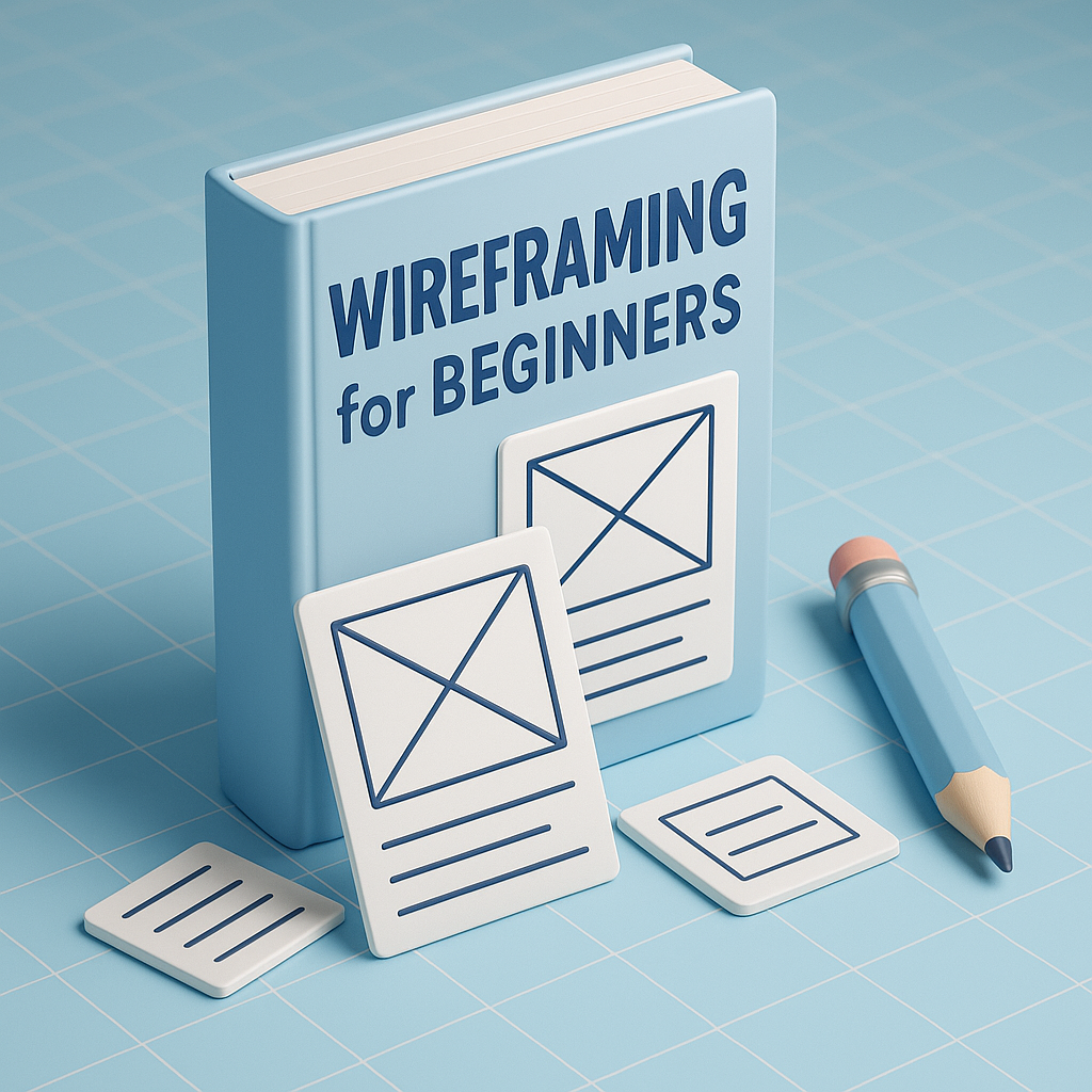
Wireframes use simple elements to represent real content—rectangles for images, lines for text, circles for icons, and blocks for buttons. These placeholders make it easy to visualize how content will be arranged without getting lost in design decoration. A wireframe may include navigation bars, footers, banners, cards, form fields, menus, pop-ups, and interactive components. Designers often add notes or arrows to explain how interactions should work, such as what happens when a user clicks a button or how a dropdown menu expands. Everything in a wireframe is minimal, intentional, and easy to adjust.
The wireframing process begins with understanding the purpose of the page or screen. Designers identify user goals, business objectives, and required features before drawing anything. Once the essentials are clear, rough sketches are created to explore ideas. These sketches then evolve into structured wireframes using tools like Figma, Adobe XD, Balsamiq, or Sketch. Designers refine the layout using grids and spacing rules to ensure clean alignment. After building several versions, they review the wireframes with the team or stakeholders, gather feedback, and revise the layout until everything flows logically and solves user needs effectively.
There are many tools available to help beginners create wireframes with confidence. Figma is the most popular because it’s free for beginners and supports real-time collaboration. Adobe XD is another lightweight option suitable for simple wireframes and prototypes. Balsamiq is perfect for low-fidelity sketch-style wireframes, while Sketch is a favorite among Mac users. Even pen and paper remain powerful for quick brainstorming sessions. These tools offer pre-built components, grids, and templates that make wireframing smoother and more efficient, even for those just getting started.
UX principles play an important role in wireframing. Clarity is crucial—users should instantly understand what each element represents. Consistency ensures familiarity across screens, helping users navigate without confusion. Visual hierarchy guides users to the most important elements first. Simplicity keeps the interface clean and prevents cognitive overload. Accessibility ensures text, buttons, and layouts can be used by all individuals, including those with disabilities. Keeping these principles in mind helps beginners design wireframes that feel natural, intuitive, and user-centered.
Beginners often make predictable mistakes when wireframing, such as adding too much detail too early or focusing on colors and decorations instead of functionality. Some overcrowd screens with unnecessary elements, making the design harder to understand. Others forget to use grids, resulting in misaligned layouts and poor spacing. Another common issue is skipping user flows, which makes interfaces feel disconnected. Avoiding these mistakes ensures wireframes are clean, professional, and easy to develop into fully functional UI designs.
Wireframing is a must-learn skill for anyone entering UI/UX design. It teaches designers how to think structurally, understand user paths, and visualize interactions logically. By beginning with wireframes, designers avoid confusion and miscommunication, allowing projects to move smoothly from idea to execution. With practice, wireframing sharpens problem-solving skills and builds confidence in designing user-centered digital experiences. Whether someone is creating a mobile app, website, or complex interface, wireframes remain the first and most important step toward designing intuitive and impactful products.
Wireframes are valuable because they eliminate distractions and help the design team focus on solving user problems. They bring clarity to the project early on, helping clients and teams align before investing time in high-fidelity UI designs. A properly constructed wireframe exposes issues long before development begins—such as confusing navigation, crowded layouts, missing elements, or unclear user flows. By testing and correcting these problems early, designers save huge amounts of time and prevent costly redesigns. For beginners, wireframes act like a roadmap, guiding them through the logic and purpose behind each screen.
There are different levels of wireframes depending on the stage of the design process. Low-fidelity wireframes are usually sketches on paper or quick digital mockups with basic shapes. They are great for brainstorming or rapid ideation. Mid-fidelity wireframes introduce cleaner alignment, structure, and grid usage, giving a clearer sense of spacing and flow. High-fidelity wireframes come closer to final interface designs but still avoid actual colors or branding—they focus on precise placement and detailed interactions. Beginners typically start with simple sketches and move toward mid- or high-fidelity versions as their understanding grows.
Wireframes use simple elements to represent real content—rectangles for images, lines for text, circles for icons, and blocks for buttons. These placeholders make it easy to visualize how content will be arranged without getting lost in design decoration. A wireframe may include navigation bars, footers, banners, cards, form fields, menus, pop-ups, and interactive components. Designers often add notes or arrows to explain how interactions should work, such as what happens when a user clicks a button or how a dropdown menu expands. Everything in a wireframe is minimal, intentional, and easy to adjust.
The wireframing process begins with understanding the purpose of the page or screen. Designers identify user goals, business objectives, and required features before drawing anything. Once the essentials are clear, rough sketches are created to explore ideas. These sketches then evolve into structured wireframes using tools like Figma, Adobe XD, Balsamiq, or Sketch. Designers refine the layout using grids and spacing rules to ensure clean alignment. After building several versions, they review the wireframes with the team or stakeholders, gather feedback, and revise the layout until everything flows logically and solves user needs effectively.
There are many tools available to help beginners create wireframes with confidence. Figma is the most popular because it’s free for beginners and supports real-time collaboration. Adobe XD is another lightweight option suitable for simple wireframes and prototypes. Balsamiq is perfect for low-fidelity sketch-style wireframes, while Sketch is a favorite among Mac users. Even pen and paper remain powerful for quick brainstorming sessions. These tools offer pre-built components, grids, and templates that make wireframing smoother and more efficient, even for those just getting started.
UX principles play an important role in wireframing. Clarity is crucial—users should instantly understand what each element represents. Consistency ensures familiarity across screens, helping users navigate without confusion. Visual hierarchy guides users to the most important elements first. Simplicity keeps the interface clean and prevents cognitive overload. Accessibility ensures text, buttons, and layouts can be used by all individuals, including those with disabilities. Keeping these principles in mind helps beginners design wireframes that feel natural, intuitive, and user-centered.
Beginners often make predictable mistakes when wireframing, such as adding too much detail too early or focusing on colors and decorations instead of functionality. Some overcrowd screens with unnecessary elements, making the design harder to understand. Others forget to use grids, resulting in misaligned layouts and poor spacing. Another common issue is skipping user flows, which makes interfaces feel disconnected. Avoiding these mistakes ensures wireframes are clean, professional, and easy to develop into fully functional UI designs.
Wireframing is a must-learn skill for anyone entering UI/UX design. It teaches designers how to think structurally, understand user paths, and visualize interactions logically. By beginning with wireframes, designers avoid confusion and miscommunication, allowing projects to move smoothly from idea to execution. With practice, wireframing sharpens problem-solving skills and builds confidence in designing user-centered digital experiences. Whether someone is creating a mobile app, website, or complex interface, wireframes remain the first and most important step toward designing intuitive and impactful products.