Multi-step Form UX Optimization focuses on improving the usability, clarity, and conversion rates of long or complex forms by breaking them into logical, manageable steps. Long single-page forms often overwhelm users, increase cognitive load, and result in high abandonment rates. By thoughtfully designing step-by-step experiences, UX designers make the process feel simpler, predictable, and more motivating—ultimately leading to better task completion and user satisfaction.
The core principle of multi-step forms is progressive disclosure. Instead of showing everything at once, information is revealed gradually as users move through the steps. This helps maintain focus and reduces the psychological resistance that often comes with filling out lengthy forms. Grouping related fields together, such as personal details, preferences, or payment information, creates structure and improves understanding. Users feel more in control because they interact with one chunk of information at a time.
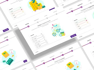
A crucial part of optimizing multi-step forms is providing a clear progress indicator. Whether it is a stepper bar, numbered labels, or percentage completion, visual progress cues reassure users that the process is finite and help them anticipate what comes next. Ambiguity is one of the main reasons users abandon forms. When they know how many steps remain, anxiety decreases, confidence increases, and motivation to complete the form grows.
Another essential element is reducing friction by minimizing unnecessary fields. UX designers should question every field: Do we really need this? Can it be optional? Can we autofill it using known user data? By eliminating redundant inputs or simplifying language, forms become faster and easier to complete. Smart defaults, dropdowns, and input masks enhance efficiency and reduce the cognitive effort required from users.
Form validation is a major factor in user experience. Multi-step forms perform best when they offer real-time error validation and helpful guidance. If a user makes a mistake, catching it immediately—rather than at the end—reduces frustration and prevents them from feeling stuck. Error messages should be polite, specific, and solution-oriented. Clear examples, inline hints, and tooltips further support user success.
Navigation flexibility is another important consideration. Many users want the ability to go back and review or edit previous steps without losing progress. Locking steps or restricting backward movement increases friction and discourages exploration. A well-optimized multi-step form allows easy backward navigation while ensuring the system retains previously entered data. Saved states and autosave features prevent loss of information during accidental refreshes or interruptions.
Visual hierarchy and simplicity play a key role in making each step approachable. Spacing, contrast, typography, and grouping should guide the user’s eye naturally from top to bottom. Consistent placement of labels, buttons, and help text improves predictability and reduces learning time. Each step should feel short—even if the overall form is long—by maintaining clean layouts and avoiding clutter.
Multi-step forms also benefit from incorporating motivation and reassurance techniques. Pre-step explanations, contextual microcopy, trust indicators, and optional previews help users understand why certain information is needed. For sensitive data sections, security badges, privacy notes, or examples make users feel safe. Reducing emotional friction is just as important as minimizing cognitive friction.
Overall, Multi-step Form UX Optimization is about turning a potentially overwhelming task into a guided, intuitive journey. By using progressive disclosure, thoughtful step grouping, clear feedback, and strong visual structure, designers create form experiences that are easier to complete and more enjoyable. This leads to higher conversion rates, fewer errors, and a more user-friendly interaction that respects both user time and comfort.
The core principle of multi-step forms is progressive disclosure. Instead of showing everything at once, information is revealed gradually as users move through the steps. This helps maintain focus and reduces the psychological resistance that often comes with filling out lengthy forms. Grouping related fields together, such as personal details, preferences, or payment information, creates structure and improves understanding. Users feel more in control because they interact with one chunk of information at a time.
A crucial part of optimizing multi-step forms is providing a clear progress indicator. Whether it is a stepper bar, numbered labels, or percentage completion, visual progress cues reassure users that the process is finite and help them anticipate what comes next. Ambiguity is one of the main reasons users abandon forms. When they know how many steps remain, anxiety decreases, confidence increases, and motivation to complete the form grows.
Another essential element is reducing friction by minimizing unnecessary fields. UX designers should question every field: Do we really need this? Can it be optional? Can we autofill it using known user data? By eliminating redundant inputs or simplifying language, forms become faster and easier to complete. Smart defaults, dropdowns, and input masks enhance efficiency and reduce the cognitive effort required from users.
Form validation is a major factor in user experience. Multi-step forms perform best when they offer real-time error validation and helpful guidance. If a user makes a mistake, catching it immediately—rather than at the end—reduces frustration and prevents them from feeling stuck. Error messages should be polite, specific, and solution-oriented. Clear examples, inline hints, and tooltips further support user success.
Navigation flexibility is another important consideration. Many users want the ability to go back and review or edit previous steps without losing progress. Locking steps or restricting backward movement increases friction and discourages exploration. A well-optimized multi-step form allows easy backward navigation while ensuring the system retains previously entered data. Saved states and autosave features prevent loss of information during accidental refreshes or interruptions.
Visual hierarchy and simplicity play a key role in making each step approachable. Spacing, contrast, typography, and grouping should guide the user’s eye naturally from top to bottom. Consistent placement of labels, buttons, and help text improves predictability and reduces learning time. Each step should feel short—even if the overall form is long—by maintaining clean layouts and avoiding clutter.
Multi-step forms also benefit from incorporating motivation and reassurance techniques. Pre-step explanations, contextual microcopy, trust indicators, and optional previews help users understand why certain information is needed. For sensitive data sections, security badges, privacy notes, or examples make users feel safe. Reducing emotional friction is just as important as minimizing cognitive friction.
Overall, Multi-step Form UX Optimization is about turning a potentially overwhelming task into a guided, intuitive journey. By using progressive disclosure, thoughtful step grouping, clear feedback, and strong visual structure, designers create form experiences that are easier to complete and more enjoyable. This leads to higher conversion rates, fewer errors, and a more user-friendly interaction that respects both user time and comfort.