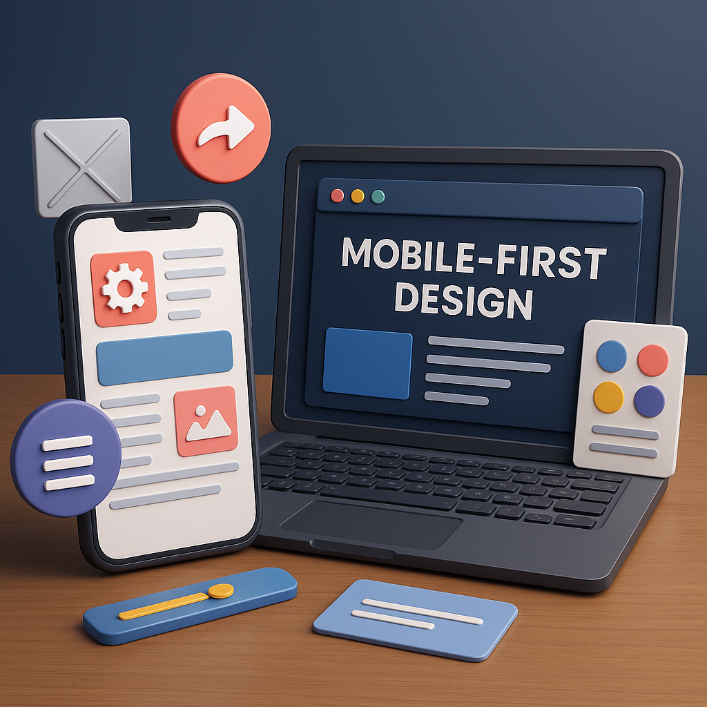
Mobile-First Design is a modern UI/UX approach that prioritizes designing for small screens before expanding the layout for larger devices like tablets and desktops. This philosophy emerged as mobile device usage surpassed desktop browsing, making smartphones the primary touchpoint for internet access. Instead of shrinking a desktop layout to fit mobile screens, designers start with a simplified, essential version for mobile and enhance the experience as screen size increases. The goal is to deliver fast, user-friendly, and efficient interfaces that meet the expectations of today’s mobile-centric audience. Mobile-First Design is not just a technique — it’s a mindset that ensures accessibility, clarity, and high performance across all devices.
Mobile usage dominates global internet traffic, and users expect smooth browsing regardless of device or network limitations. Slow, cluttered, or unoptimized mobile interfaces result in high bounce rates, poor engagement, and low conversions. Search engines like Google also favor mobile-optimized websites, ranking them higher through mobile-first indexing. Businesses that neglect mobile UX lose a significant portion of potential customers. Mobile-First ensures that the core functionality, content, and interactions are optimized for small screens, resulting in a more inclusive and future-proof design system that scales naturally to tablets and desktops.
Mobile-First Design is guided by essential principles like simplicity, clarity, and performance. Designers focus only on essential content, keeping layouts clean and free from unnecessary distractions. Thumb-friendly interactions, readable typography, and minimal navigation become priorities. Since mobile devices have limited screen space, designers must make decisions that improve usability, such as prioritizing important elements, creating intuitive hierarchies, and ensuring fast loading times. Performance is also a core principle — optimized images, lightweight code, and efficient components help mobile devices load applications quickly even with weaker network connections.
One of the most important steps in Mobile-First Design is identifying the most essential content. Designers use content audits, user flows, and business goals to determine what users must see first. Visual hierarchy is then built around these elements using size, color, spacing, and typography to guide the user’s focus. Since mobile screens are vertical and narrow, scrolling becomes a natural part of the experience. Designers create layouts that feel intuitive by placing high-priority elements at the top, grouping relevant information, and maintaining a consistent structure throughout the page. These choices help users accomplish tasks faster and with minimal cognitive load.
Navigation design plays a crucial role in mobile usability. With limited screen space, designers must choose navigation patterns that are efficient and thumb-friendly. Common mobile navigation systems include the hamburger menu, bottom navigation bar, floating action buttons (FAB), and tab bars. Each pattern has its own strengths: bottom navigation is ideal for frequently used features, while hamburger menus hide less important items. Designers also consider reachability — placing key actions within the thumb zone enhances comfort and accessibility. Mobile-First navigation simplifies the user journey, reduces friction, and improves overall interaction quality.
Mobile-First Design goes hand-in-hand with responsive design techniques. Once the mobile version is complete, designers expand the layout for larger screens using CSS breakpoints and scalable grids. This process is known as progressive enhancement, where additional features, visuals, and interactions are introduced only as screen size allows. This approach ensures consistent user experience across all devices without compromising performance. Instead of removing elements to make a desktop design fit mobile, designers add enhancements to mobile-optimized foundations — a more logical and user-friendly workflow.
Mobile users interact with touchscreens, which introduces a different set of interaction behaviors compared to desktop devices. Designers must accommodate gestures such as swiping, pinching, tapping, long-pressing, and dragging. Buttons must be appropriately sized (at least 44px) to prevent accidental taps. Spacing, padding, and layout density must align with touch-based usability guidelines. Designers also consider feedback through animations, vibrations, or micro-interactions to make mobile experiences feel more responsive. Mobile-First Design embraces natural gesture-based interactions, creating intuitive, seamless, and enjoyable user experiences.
Speed is one of the biggest factors influencing mobile user satisfaction. Mobile users often rely on slower networks, making performance optimization essential. Designers and developers work together to compress images, use modern file formats, reduce JavaScript weight, and enable lazy loading. Clean UI, lightweight fonts, and optimized assets help applications load quickly and function smoothly. Faster interfaces lead to better engagement, higher user satisfaction, and improved search engine rankings. Mobile-First inherently encourages performance efficiency and minimalism, which are beneficial across all devices.
Mobile-First Design is evolving as technology advances. With foldable devices, wearable technology, and voice-enabled interactions, user experience design is becoming more adaptive and context-aware. Designers now consider multi-device journeys, responsive typography, dark mode, accessibility guidelines, and personalized user paths. Mobile-First remains a powerful foundation for future UI/UX trends because it prioritizes user comfort, performance, and clarity. As mobile usage continues to grow globally, mastering Mobile-First Design is essential for creating modern digital experiences that are both intuitive and impactful.