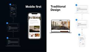
Mobile-first and responsive UI design have become essential strategies in modern web and app development due to the rapid growth of mobile device usage. Today, billions of users access websites, applications, and digital services from smartphones and tablets rather than traditional desktops. This shift has forced designers and developers to rethink how interfaces are structured, how content is prioritized, and how interactions should be optimized for smaller screens. Mobile-first design means designing for the smallest screen size first, then progressively enhancing the interface for larger screens like tablets and desktops. This approach ensures that essential content is accessible, load times are fast, and navigation remains intuitive on mobile devices. On the other hand, Responsive UI design ensures that layouts automatically adjust and adapt to different screen sizes using flexible grids, fluid images, breakpoints, and CSS media queries. When these two concepts work together, they create seamless user experiences across all devices. With the rise of mobile commerce, voice search, location-based services, and on-the-go browsing, designing mobile-first has become a necessity for improving user engagement, reducing bounce rates, and increasing overall accessibility. As digital experiences continue to evolve, adopting a mobile-first mindset ensures products remain user-centric, performance-driven, and aligned with today’s mobile-dominant world.
Mobile-first design focuses on placing the most important content and features at the forefront so users can access what they need quickly and easily. On small screens, designers must prioritize essential functionality, remove unnecessary elements, and present information in a logical and minimal layout. Content hierarchy becomes critical—headlines, CTAs (Call-to-Actions), menus, and primary features must be clearly visible and easy to reach. Navigation on mobile devices must be simple, thumb-friendly, and based on intuitive patterns like bottom navigation bars, hamburger menus, and swipe gestures. Since mobile users rely heavily on touch interactions, UI elements need proper spacing, larger tap targets, and smooth gesture responsiveness. Speed is another major factor. Mobile-first UI design emphasizes performance optimization by reducing heavy scripts, compressing images, minimizing HTTP requests, and using efficient caching techniques. Faster load times lead to better user experience and higher search engine rankings because Google prioritizes mobile-friendly websites.
Designers must also consider accessibility by ensuring readable typography, sufficient color contrast, scalable fonts, and alternative text for images. Mobile-first design encourages progressive enhancement, where basic functionality works without JavaScript, and additional features activate on more capable devices. This approach avoids broken experiences on older devices or unstable network conditions. Ultimately, mobile-first design ensures that the core functionality is robust, efficient, and user-friendly on the smallest screen before scaling to richer desktop layouts.
Responsive UI design ensures that applications adapt gracefully to different screen sizes, resolutions, and device orientations. Designers utilize flexible grid systems such as 12-column layouts, CSS Flexbox, and CSS Grid to structure content. These flexible grids allow elements to resize, rearrange, or stack depending on screen width. Breakpoints define where the layout should adjust, typically targeting device ranges such as mobile, tablet, laptop, and desktop. Common breakpoints include 360px, 768px, 1024px, and 1440px. Responsive designs rely on fluid images that scale proportionally, ensuring visuals do not overflow or distort. CSS media queries enable fine control over typography, spacing, layout, and content visibility based on screen size.
Modern UI design often uses responsive components that automatically adapt, such as responsive cards, buttons, forms, and navigation bars. Designers also create adaptive layouts that switch from vertical scrolling on mobile to multi-column layouts on desktop. Responsive UI design must account for variations like dark mode, high-refresh displays, notch screens, foldable devices, and ultra-wide monitors. Testing is crucial: designers test responsive layouts across real devices, emulators, browser tools, and screen readers to ensure consistency.
The benefit of responsive design is that one codebase supports multiple devices, reducing development and maintenance costs. It also increases accessibility, enhances SEO, and provides a smooth user experience across diverse device environments. Combined with mobile-first philosophy, responsive design ensures digital experiences feel natural, scalable, and visually appealing everywhere.
Designing mobile-first and responsive UIs comes with both challenges and best practices. Ensuring compatibility across hundreds of devices—each with unique sizes, aspect ratios, and performance levels—can be complex. Designers must balance aesthetics with performance, maintaining visual quality without sacrificing load speed. Using scalable vector graphics (SVGs), modern image formats (WebP/AVIF), and lazy loading helps reduce this burden. Additionally, navigation patterns must remain consistent across devices; a navigation drawer may work well on mobile, while a horizontal menu suits desktops. Content parity is another important consideration—core content should remain accessible across all devices without hiding crucial information behind collapsible menus.
Looking ahead, the future of mobile-first responsive design will be shaped by new technologies such as foldable devices, augmented reality interfaces, voice-controlled navigation, and AI-powered personalization. Designers must adapt to dynamic layouts that respond to device posture, rotation, and multi-screen interactions. Tools like responsive design systems, fluid typographic scales, variable fonts, and auto-layout systems will continue to simplify the design process. As 5G and high-speed connectivity become widespread, mobile applications will become more interactive, richer, and feature-heavy. However, the foundation of great mobile-first design will remain the same—clarity, simplicity, performance, and accessibility. By mastering mobile-first and responsive UI principles, designers can build flexible digital experiences that delight users and remain relevant in a rapidly evolving technological landscape.