Material Design Guidelines are Google’s comprehensive design system that helps developers and designers create intuitive, consistent, and visually pleasing mobile and web experiences. It introduces a structured approach to layout, typography, color, interaction, and motion so that apps feel familiar and predictable to users across devices. At its core, Material Design focuses on clarity, meaning, and usability, making sure every UI decision has purpose and supports real user needs.
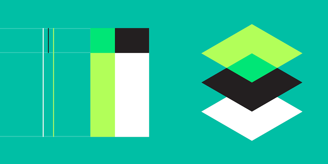
A major principle of Material Design is the use of material as a metaphor. The interface behaves like a physical surface: elements cast shadows, have depth, and move realistically. This concept helps users understand hierarchy and focus because components look and behave like objects with weight and spatial relationships. Elevation values, shadows, and layering are essential tools for achieving this sense of depth.
Color plays a central role in Material Design, where the guidelines recommend using a well-structured palette with primary, secondary, and accent colors. These colors should maintain contrast for accessibility, especially for text and buttons. The system also emphasizes dynamic color in newer versions, where UI themes adapt based on user preferences, improving personalization and comfort.
Typography in Material Design ensures readability and visual consistency. Google’s recommended fonts, primarily Roboto and Noto, support a wide range of languages and look clean across screen sizes. The system promotes a hierarchy of text styles—headline, subtitle, body, caption—to guide users’ attention and deliver clear communication.
Layouts in Material Design rely heavily on grids, spacing rules, and alignment. The use of an 8dp or 4dp spacing grid ensures that components remain visually balanced and scalable across devices. Responsive design is a key focus, making applications adaptable to phones, tablets, foldable devices, and desktops. Consistency in spacing brings harmony and reduces cognitive load.
Another core area is motion design, which Material Design treats as a functional element rather than decoration. Animations guide user attention, explain transitions, and provide feedback. Motion communicates how elements relate to each other and ensures interactions feel smooth and meaningful. Subtle animations reinforce the physical metaphor behind UI behavior.
Interactions in Material Design focus on user expectations and familiar patterns. Buttons, cards, sheets, and dialogs behave predictably, reducing confusion. Touch targets are standardized at 48dp to ensure comfortable tapping. Feedback through ripple effects or color changes confirms that actions are recognized, improving the sense of control.
Accessibility is deeply integrated into Material Design Guidelines. It encourages large enough text, proper contrast ratios, screen-reader support, and meaningful labels to ensure inclusivity. By prioritizing accessibility from the start, developers build apps that work well for users with diverse abilities and environments.
Overall, Material Design Guidelines provide a powerful foundation for creating polished, user-friendly interfaces. By following its principles, developers can build apps that feel consistent, modern, and easy to navigate. The framework continues to evolve, offering updated components and adaptive design patterns suited for today’s multi-device world.