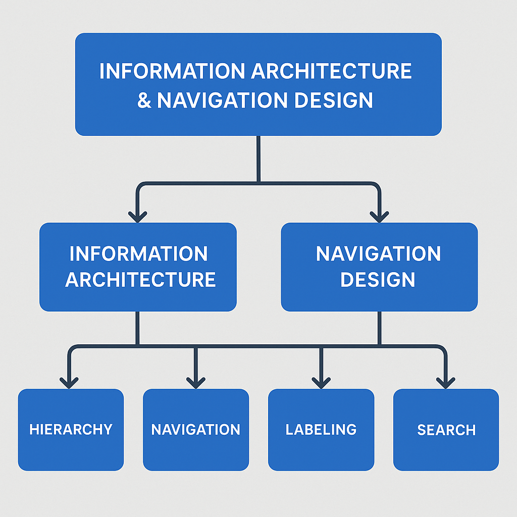
Information Architecture (IA) and Navigation Design stand at the foundation of every successful digital experience, forming the invisible yet powerful backbone that shapes how users understand, access, and interact with information within digital products such as websites, mobile apps, enterprise dashboards, e-commerce platforms, and SaaS tools. While UI design focuses on visual aesthetics, color, typography, and interface components, IA and navigation focus on logic, structure, clarity, and the user’s cognitive journey through a system. In a time where users are constantly bombarded with information, products must be thoughtfully organized to reduce friction, eliminate confusion, and ensure that users reach their goals smoothly. Information Architecture begins with understanding users deeply—how they think, what mental models they rely on, what vocabulary they are comfortable with, and how they expect information to be grouped logically. Designers must build structured ecosystems where content is arranged into categories, subcategories, hierarchies, and relationships that feel intuitive, predictable, and easy to follow. When information is scattered, mislabeled, or buried under layers of complexity, users grow frustrated, abandon tasks, and lose trust in the product. Strong IA ensures that even complex content ecosystems feel simple, natural, and effortless, enabling users to locate what they need instantly, whether it’s a product on an e-commerce website, a setting in a mobile app, or a report in a dashboard.
Navigation Design transforms this underlying structure into practical, interactive pathways that users rely on to move through the product. It includes the placement and behavior of navigation bars, menus, search bars, breadcrumbs, tabs, icons, and links that guide users through important tasks. Effective navigation behaves like a map—clear, predictable, and consistent—ensuring users always know where they are, where they came from, and where they can go next. Good navigation removes guesswork and increases confidence, whereas poor navigation forces users to rely on trial and error, backtracking, and unnecessary mental effort. In digital product design, the goal is not just to provide access to information but to streamline the user’s journey so well that they barely notice the complexity beneath the surface. This is where IA and navigation work together: IA defines the “what” and “where” of content, while navigation defines the “how.” Together, they create an experience that feels natural, logical, and efficient.
At the core of IA is the concept of findability, the ease with which users can locate information regardless of its format or structure. Even a beautifully designed interface fails if users cannot find what they are looking for within seconds. To achieve high findability, designers use several IA techniques such as card sorting, where users group related information in ways that make sense to them; tree testing, which validates whether users can successfully navigate through a structure; and sitemap creation, which visualizes the hierarchy and relationships between different sections of the product. Card sorting reveals the mental models users naturally adopt, allowing designers to create categorizations that align with user expectations instead of organizational assumptions. Tree testing ensures that the hierarchy and labels work in real-world scenarios, identifying problem areas where users get lost or confused. Sitemaps form the skeleton of the product, defining the overall structure before visual design even begins. Without such foundational work, interfaces may look attractive on the surface while hiding structural inefficiencies that lead to confusion beneath.
Navigation Design, on the other hand, focuses on presenting this organized information through usable, familiar, and consistent patterns. Different products support different navigation styles: websites often use top navigation bars and mega menus for complex content; mobile apps rely on bottom tab bars, hamburger menus, and swipe gestures; dashboards use sidebars and breadcrumb trails to help users drill deeper into data while maintaining context. Navigation is more than menus—it is how users move through screens, complete tasks, and return to previous points in their journey. Effective navigation reduces cognitive load by limiting choices, ensuring consistency, and maintaining a clear flow from general to specific content. Breadcrumbs offer context in complex hierarchies by showing users exactly where they are. Search navigation supplements traditional menus, enabling users to bypass multiple steps. Secondary navigation patterns such as filters, tabs, tags, pagination, and quick links further enhance usability by reducing the effort required to explore content.
A well-designed IA and navigation system also enhances accessibility, ensuring that content can be accessed by users with disabilities, screen readers, keyboard navigation, and assistive technologies. Clear labels, logical hierarchy, predictable navigation controls, and structured content help all users—not only those with disabilities. WCAG (Web Content Accessibility Guidelines) emphasize proper document structure, keyboard access, meaningful link labels, and consistency—principles that overlap heavily with IA best practices. Accessibility is not an add-on; it is a core outcome of thoughtful IA and navigation. When content is well structured, screen readers can easily interpret it, navigation flows make more sense, and users with limited motor abilities can move more smoothly through the interface.
Another critical benefit of strong IA and navigation is scalability, the ability of the product to grow without becoming cluttered or confusing. As businesses expand, so does their content ecosystem—new pages, new settings, new product lines, new features. Without a solid IA foundation, adding new sections becomes chaotic, navigation becomes crowded, and the product eventually requires costly redesigns. Good IA anticipates future growth by designing flexible, expandable structures that accommodate change. For example, an e-commerce platform that organizes products by category and subcategory can easily add new product lines without disrupting existing flows. A mobile app with a modular navigation system can introduce new features without overwhelming users. Scalable IA ensures long-term usability and reduces the need for constant re-architecture.
User-centered IA is built around the understanding that users do not think in technical terms—they think in goals, tasks, and familiar concepts. When product teams use internal terminology or company-focused structures, users get lost because they cannot map the content to their own expectations. A classic example is a university website where departments are labeled according to administrative structures rather than student needs. This mismatch leads to confusion. User-centered IA aligns labeling, organization, and hierarchy with user mental models, ensuring clarity and efficiency. Designers use methods such as user interviews, persona creation, task analysis, and journey mapping to understand what users expect and how they behave. These insights shape the IA, ensuring it feels natural and intuitive to the target audience.
Navigation Design also relies on consistency—patterns must repeat across the product so that users develop familiarity and confidence. When navigation systems vary from page to page, users must constantly relearn interactions, which increases cognitive load and reduces usability. Consistency applies not only to layout but also to labels, icons, button styles, and behavior. For instance, if the “Settings” icon appears as a gear in one section and as a text label in another, confusion arises. If a back button behaves differently on different screens, users lose trust. Predictability is key: users should always know what will happen when they click something. Navigation should support fast orientation and fast decision-making.
Visual hierarchy plays a crucial role in IA and navigation as well. It guides users’ eyes to the most important elements through size, spacing, contrast, typography, and alignment. Strong visual hierarchy helps users process information quickly, identify primary actions, and understand relationships between elements. In navigation systems, hierarchy helps differentiate between primary and secondary menus, major categories and subcategories, important actions and secondary options. Hierarchy reduces clutter and prevents overwhelming users with too much information at once.
Search functionality is another powerful navigation tool, especially for content-heavy products like e-commerce, news portals, or documentation websites. A well-designed search system includes autocomplete, filters, suggestions, synonyms, and error tolerance. Search should complement—not replace—structured navigation, offering a quick path for users who already know what they’re looking for. IA informs search design by defining metadata, tagging systems, and content relationships that ensure accurate search results.
Microinteractions and motion design further enhance IA and navigation by providing feedback, guiding transitions, and improving clarity. Subtle animations can reveal new sections, highlight active states, or gently guide users through navigation flows. When menus slide, fade, or expand smoothly, users better understand movement between levels of hierarchy. However, animations must remain functional, not decorative—they must support clarity and reduce confusion, not distract.
Effective IA and navigation also rely heavily on analytics and user behavior data. Heatmaps, session recordings, click paths, and drop-off reports help designers identify where users get stuck, which pages cause confusion, and which navigation elements fail to guide users correctly. Data-driven IA evolves over time, adapting based on real user interactions rather than assumptions. Combining analytics with usability testing offers powerful insights: designers observe where users struggle, what paths they take, and how long it takes to find key information. These insights lead to iterative improvements in the structure and navigation.
In modern digital ecosystems, omnichannel experiences also play a role in IA. Users may begin a task on a mobile app, continue on a desktop website, and finish on a tablet. IA must support consistency across platforms, ensuring labels, structures, and navigation patterns align across devices. Cross-platform consistency reduces mental load, supports brand identity, and ensures smooth user transitions.
Ultimately, Information Architecture and Navigation Design are about guiding users effortlessly through digital environments. They reduce friction, enhance usability, improve accessibility, and elevate the overall user experience. A well-structured IA empowers users, increases satisfaction, boosts engagement, and drives conversions. Navigation empowers users by giving them freedom, control, and clarity. Together, IA and navigation transform complexity into simplicity—turning large ecosystems into intuitive, user-friendly experiences. Products may evolve, features may change, and interfaces may be redesigned, but strong IA and navigation remain the timeless pillars that determine whether a digital experience feels confusing or seamless, overwhelming or empowering, frustrating or joyful. Designers who master IA and navigation ultimately master the user’s journey, shaping experiences that not only work but truly resonate.