Designing dashboards for beginners starts with understanding the fundamental purpose of a dashboard: providing a clear, visual summary of information that supports quick decision-making. Most beginners assume dashboards are simply collections of charts placed together, but effective dashboard design goes far beyond that. A great dashboard distills insights from complex datasets into an intuitive visual interface that can be understood at a glance. This means a designer must evaluate what matters most to users, what actions the data should support, and how frequently the dashboard will be accessed. Establishing clarity and context is the foundation of any dashboard project. Before selecting colors, charts, or widgets, a beginner should spend time identifying the goals of the dashboard—monitoring performance, tracking KPIs, analyzing historical trends, or predicting future behavior. These decisions are crucial because they influence every design choice that follows.
Once the purpose is defined, the next essential step in dashboard design is understanding the audience. A dashboard for executives differs significantly from a dashboard for operational staff or marketing analysts. Executives typically need high-level KPIs presented concisely for quick decision-making, while analysts may require deeper interaction, filters, or drill-down capabilities. Beginners often design dashboards based on assumptions instead of research, leading to cluttered layouts that overwhelm users. Therefore, designers must analyze user needs, technological proficiency levels, and usage patterns. For example, frequent users value detailed data and exploration tools, whereas occasional users need simplicity and guided interactions. Tailoring the dashboard to its audience ensures relevance, usability, and higher engagement.
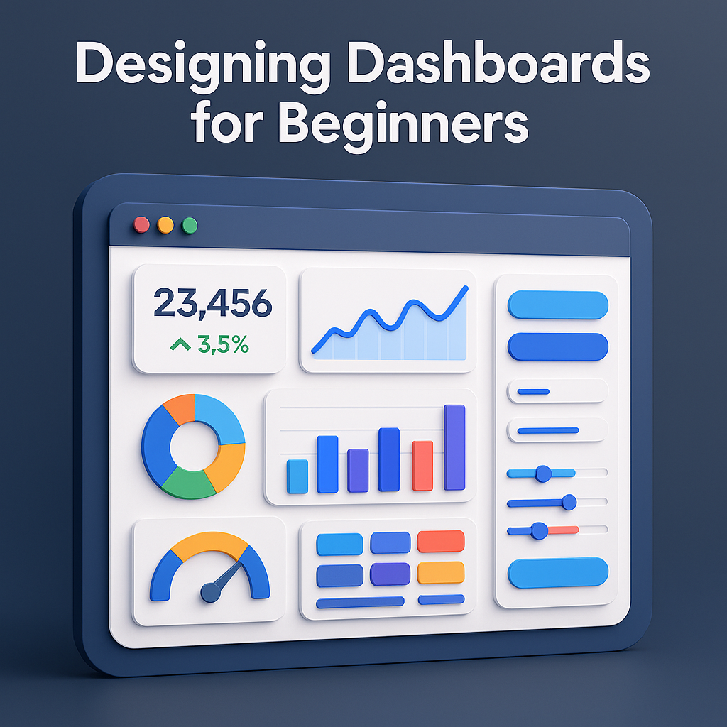
The visual layout is one of the most important aspects of dashboard design, especially for beginners. A clean and consistent layout improves readability, reduces cognitive load, and helps users quickly locate the most important information. Designers should use visual hierarchy to guide the user’s eye: key metrics at the top, supporting trends in the middle, and deeper insights at the bottom. Additionally, grid-based layouts enhance alignment and structure, making the dashboard look professional and organized. Spacing and grouping related elements help avoid overcrowding and confusion. Beginners must resist the urge to fill every space with charts; instead, they should focus on clarity, balance, and efficient use of screen real estate.
Choosing the right visualization types is another crucial skill for beginners in dashboard design. Not all charts serve the same purpose, and selecting the wrong one can lead to misinterpretation. Line charts are ideal for trends over time, bar charts compare categories, pie charts show proportions (though should be used sparingly), and heatmaps highlight intensity or patterns. Gauge charts can display progress toward a target but may consume too much space if overused. Beginners must learn to match data to the chart type that communicates it most effectively. The guiding principle is simplicity: the chart should communicate the insight immediately, without requiring users to decode complex visuals. Clear labeling, titles, and legends are essential for enhancing comprehension.
Color plays a powerful role in dashboard design and is often misused by beginners. Colors should enhance readability and direct attention—not create visual noise. Designers should stick to a limited palette, using neutral tones for background elements and bold colors to highlight key metrics or alerts. Color coding can support categorization, differentiate trends, or indicate performance thresholds (e.g., red for issues, green for success). Accessibility must also be considered; colors should be distinguishable for users with visual impairments, and information should never rely solely on color. Maintaining consistency across the dashboard is essential, as inconsistent color usage can confuse users and dilute meaning.
Interactivity is an essential component of modern dashboards, allowing users to explore data at their own pace. Beginners frequently overuse interactive elements such as filters, dropdowns, and drill-downs, which can overwhelm or confuse users. Instead, interactions should be intentional and user-focused. Filters can help users customize views according to time ranges, departments, or categories. Tooltips can provide additional details without cluttering the main layout. Drill-downs allow users to access deeper insights when needed. The goal is to enhance user experience without complicating navigation. Thoughtful interaction design increases the dashboard’s flexibility and usefulness, giving users control over how they consume information.
Performance and data accuracy are essential factors in dashboard design. Even the most visually appealing dashboard becomes useless if the underlying data is incorrect, outdated, or slow to load. Beginners must ensure proper data cleaning, validation, and integration before feeding information into visualizations. Real-time dashboards must handle frequent updates efficiently. Designers should also optimize performance by limiting heavy queries, reducing excessive visual elements, and implementing caching mechanisms where necessary. A dashboard must not only look good but also perform smoothly and reliably, otherwise users will lose trust in the system.
Testing and iteration are critical final stages in the dashboard design process. Beginners often skip user testing, but this step is vital to ensure the dashboard fulfills user expectations. Gathering feedback from stakeholders, observing how they interact with the dashboard, and understanding areas of confusion allows designers to make meaningful improvements. A dashboard is rarely perfect on the first attempt; refining the layout, adjusting visual hierarchy, simplifying interactions, and clarifying text labels are common adjustments. Iteration transforms a good dashboard into a great one. Continuous testing ensures that the dashboard remains relevant and useful as business needs evolve.
Finally, maintaining and updating dashboards is just as important as designing them. Over time, business requirements change, KPIs evolve, and new data sources emerge. Beginners must recognize that dashboards are living systems requiring periodic review and enhancement. Outdated charts, unused metrics, or broken data sources harm user experience and decision-making. A well-maintained dashboard stays aligned with organizational goals and continues to deliver value. The best dashboards are not only well-designed at launch but consistently adapted to remain effective tools for insight and action.
Once the purpose is defined, the next essential step in dashboard design is understanding the audience. A dashboard for executives differs significantly from a dashboard for operational staff or marketing analysts. Executives typically need high-level KPIs presented concisely for quick decision-making, while analysts may require deeper interaction, filters, or drill-down capabilities. Beginners often design dashboards based on assumptions instead of research, leading to cluttered layouts that overwhelm users. Therefore, designers must analyze user needs, technological proficiency levels, and usage patterns. For example, frequent users value detailed data and exploration tools, whereas occasional users need simplicity and guided interactions. Tailoring the dashboard to its audience ensures relevance, usability, and higher engagement.
The visual layout is one of the most important aspects of dashboard design, especially for beginners. A clean and consistent layout improves readability, reduces cognitive load, and helps users quickly locate the most important information. Designers should use visual hierarchy to guide the user’s eye: key metrics at the top, supporting trends in the middle, and deeper insights at the bottom. Additionally, grid-based layouts enhance alignment and structure, making the dashboard look professional and organized. Spacing and grouping related elements help avoid overcrowding and confusion. Beginners must resist the urge to fill every space with charts; instead, they should focus on clarity, balance, and efficient use of screen real estate.
Choosing the right visualization types is another crucial skill for beginners in dashboard design. Not all charts serve the same purpose, and selecting the wrong one can lead to misinterpretation. Line charts are ideal for trends over time, bar charts compare categories, pie charts show proportions (though should be used sparingly), and heatmaps highlight intensity or patterns. Gauge charts can display progress toward a target but may consume too much space if overused. Beginners must learn to match data to the chart type that communicates it most effectively. The guiding principle is simplicity: the chart should communicate the insight immediately, without requiring users to decode complex visuals. Clear labeling, titles, and legends are essential for enhancing comprehension.
Color plays a powerful role in dashboard design and is often misused by beginners. Colors should enhance readability and direct attention—not create visual noise. Designers should stick to a limited palette, using neutral tones for background elements and bold colors to highlight key metrics or alerts. Color coding can support categorization, differentiate trends, or indicate performance thresholds (e.g., red for issues, green for success). Accessibility must also be considered; colors should be distinguishable for users with visual impairments, and information should never rely solely on color. Maintaining consistency across the dashboard is essential, as inconsistent color usage can confuse users and dilute meaning.
Interactivity is an essential component of modern dashboards, allowing users to explore data at their own pace. Beginners frequently overuse interactive elements such as filters, dropdowns, and drill-downs, which can overwhelm or confuse users. Instead, interactions should be intentional and user-focused. Filters can help users customize views according to time ranges, departments, or categories. Tooltips can provide additional details without cluttering the main layout. Drill-downs allow users to access deeper insights when needed. The goal is to enhance user experience without complicating navigation. Thoughtful interaction design increases the dashboard’s flexibility and usefulness, giving users control over how they consume information.
Performance and data accuracy are essential factors in dashboard design. Even the most visually appealing dashboard becomes useless if the underlying data is incorrect, outdated, or slow to load. Beginners must ensure proper data cleaning, validation, and integration before feeding information into visualizations. Real-time dashboards must handle frequent updates efficiently. Designers should also optimize performance by limiting heavy queries, reducing excessive visual elements, and implementing caching mechanisms where necessary. A dashboard must not only look good but also perform smoothly and reliably, otherwise users will lose trust in the system.
Testing and iteration are critical final stages in the dashboard design process. Beginners often skip user testing, but this step is vital to ensure the dashboard fulfills user expectations. Gathering feedback from stakeholders, observing how they interact with the dashboard, and understanding areas of confusion allows designers to make meaningful improvements. A dashboard is rarely perfect on the first attempt; refining the layout, adjusting visual hierarchy, simplifying interactions, and clarifying text labels are common adjustments. Iteration transforms a good dashboard into a great one. Continuous testing ensures that the dashboard remains relevant and useful as business needs evolve.
Finally, maintaining and updating dashboards is just as important as designing them. Over time, business requirements change, KPIs evolve, and new data sources emerge. Beginners must recognize that dashboards are living systems requiring periodic review and enhancement. Outdated charts, unused metrics, or broken data sources harm user experience and decision-making. A well-maintained dashboard stays aligned with organizational goals and continues to deliver value. The best dashboards are not only well-designed at launch but consistently adapted to remain effective tools for insight and action.